
An options risk graph plots a trade's profit or loss across a range of underlying prices, so you can spot max profit, max loss, and breakeven points before you risk a dollar. It's the fastest way to compare strategies side by side. Once you know how to read one, you'll size positions, plan exits, and stress-test scenarios with far more confidence.
TL;DR:
- The maximum profit and loss are key points on the risk graph, with max profit capped for spreads and unlimited for naked long calls.
- Breakeven points are derived from strike prices and premiums, with multiple breakevens possible in complex trades like iron condors.
- Greeks such as delta, gamma, theta, and vega influence the movement of the curve before expiration, especially around earnings data.
- Scenario modeling and including volatility shifts help traders assess expected value and avoid high-POP trades with poor payoff.
- Relying solely on the expiration curve ignores how positions behave during holding periods, risking significant surprises if not modeled properly.
Table of Contents
- What an Options Risk Graph Shows You
- The Numbers That Actually Matter on the Curve
- Three Worked Examples: Long Call, Vertical Spread, Iron Condor
- Why the Curve Moves Before Expiration: Delta, Gamma, Theta, and Vega
- Turning the Graph Into a Trade Decision
- Mistakes That Wreck Otherwise Good Setups
- Where a Decision-Intelligence Layer Fits Alongside the Graph
- Treat the Graph as a Gatekeeper, Not a Forecast
- An Optional Layer for Traders Who Want More Consistency
- Sources
What an Options Risk Graph Shows You
Every options risk graph runs on two axes. The horizontal axis tracks the underlying price. The vertical axis tracks net profit or loss in dollars. Where the curve crosses zero, you've found a breakeven. Where it flattens, you've found a capped max profit or max loss. Britannica's breakdown of options risk profiles confirms this is the standard framework for defined-profit and defined-loss trades.
Strike prices show up as inflection points, the spots where the line changes slope because an option moves in or out of the money. Most platforms plot several curves at once:
- Expiration line, usually solid, showing the final outcome at expiry
- Today (T+0) line, showing current profit or loss based on live pricing
- Intermediate date lines, showing how the position evolves week by week
These curves differ because time value erodes as expiration approaches, a point Investopedia's risk graph explainer illustrates well with dashed and solid curve comparisons. The T+0 line always sits below the expiration line for long premium positions, since it hasn't collected all the decay yet.
The Numbers That Actually Matter on the Curve
A risk graph is only useful if you know which numbers to pull off it. Four metrics do the heavy lifting:
- Max profit: the highest point the curve reaches, capped for spreads and condors, unlimited for a naked long call
- Max loss: the lowest point the curve touches, capped for defined-risk trades, potentially open-ended for naked short positions
- Breakeven(s): where the curve crosses zero, calculated directly from strikes and net premium paid or received
- Probability of profit (POP): not shown on the curve itself, but calculated from implied volatility and time to expiration
For a single-leg trade, breakeven is one number. For an iron condor, you're working with two. Undefined-risk trades, like a naked short call, have a max loss that's theoretically unlimited, and the graph will show a curve that keeps sloping downward without ever flattening.
POP tells you how often a trade should land inside the profit zone. But POP alone can be misleading. Pairing it with expected value, as TradeAlgo's options profit calculator guide recommends, tells you whether the payoff justifies the risk. A trade with 80% POP and a tiny payoff can carry worse expected value than a 40% POP trade with a large one.
Three Worked Examples: Long Call, Vertical Spread, Iron Condor
Numbers make this concrete. Here's how the graph reads for three common structures.
-
Long call. Say you pay a $3.00 premium for a call at a $100 strike. Your breakeven is above the strike price by the premium paid. Below breakeven, you lose the full premium paid. Above it, the profit potential rises unlimitedly. The Investopedia risk graph walkthrough uses a nearly identical setup to show the inflection point right at the strike.
-
Bull call spread. Buy a $100 call for $3.00, sell a $110 call for $1.00. Net debit: $2.00. Breakeven sits at $102. Max profit caps at $8.00 (the $10 strike width minus the $2 debit) once the stock clears $110. Max loss caps at $2.00 below $100. The curve shows two inflection points and a flat ceiling, the signature of a capped-upside trade.
-
Iron condor. Sell a $95 put, buy a $90 put, sell a $105 call, buy a $110 call, collecting $1.50 net credit. You have two breakevens: $93.50 and $106.50. Max profit is the $1.50 credit if the stock stays between the short strikes. Max loss is $3.50 (the $5 wing width minus the credit) if it breaks either wing. Wider wings raise max loss but usually raise the credit too.
Why the Curve Moves Before Expiration: Delta, Gamma, Theta, and Vega
The expiration curve is a snapshot of one moment. The T+0 curve is alive, and it moves constantly because of the Greeks. Expiration graphs show sharp kinks at each strike. Real-time curves are smoother, because delta and gamma haven't fully committed the position to its final shape yet.
- Delta and gamma measure directional exposure and how fast that exposure accelerates near a strike, which is why a position can flip from mildly profitable to sharply losing in a single session
- Theta eats into the curve every day, gradually shrinking the width of your profit zone as expiration nears
- Vega ties your P&L to implied volatility, independent of where the stock actually trades
The clearest vega lesson shows up around earnings. A Tastytrade breakdown of IV crush describes implied volatility dropping from roughly 65% to 32% right after an earnings release, which can erase an option's value even if the stock moves in the direction you predicted. This is exactly why Options Trigger's risk management framework pushes traders to model Greeks and volatility scenarios instead of trusting a static expiration line alone.
Pro Tip: Before any earnings trade, pull up the option chain and check current implied volatility against its 30 day average. If it's sitting near a multi-month high, assume a vega hit is coming regardless of which way the stock moves.
Turning the Graph Into a Trade Decision
A risk graph is a planning tool, not a crystal ball. Put it to work before you enter, not after.
Start with position sizing. If your account risks 1 to 2% of equity per trade, and your max loss on an iron condor is $350 per contract, a $50,000 account limits you to roughly one to three contracts. Next, run scenarios. Shift implied volatility up and down 20 to 40% and check where your P&L lands under each condition, a practice TradeAlgo's guide to modeling trades treats as standard due diligence for anyone holding through an event.
- Calculate POP, then multiply outcomes by probability to get expected value, not just a win rate
- Reject high-POP trades with poor expected value, and accept lower-POP trades when the payoff justifies the risk
- Set a partial-profit target, many disciplined traders close defined-risk trades once they hit 50% of max profit rather than holding for the full amount
- Use a premium percentage stop, closing a losing position once it hits a fixed loss threshold rather than watching it bleed toward max loss
- Add a time-based rule, exiting trades with little theta benefit left once only a few days of premium decay remain
Our guide to analyzing options trades walks through this scenario-modeling process with additional worked numbers.
Mistakes That Wreck Otherwise Good Setups
Most blown-up trades didn't fail because the strategy was wrong. They failed because the trader looked at one curve and ignored everything else.
The biggest mistake is treating the expiration-only view as the entire decision. It ignores how the position behaves for the weeks you're actually holding it. A close second is sizing a position without checking correlation. If you're holding three tech-sector spreads, your portfolio delta may be far larger than any single graph suggests, a risk the net position tracking guide from Trading Floor addresses directly.
- Confirm position size against your 1 to 2% account risk rule
- Set a hard stop loss and a partial-profit target before entry
- Check POP and expected value together, not POP alone
- Model IV up and down 20 to 40% for event-driven trades
- Review portfolio delta and correlation across open positions
Where a Decision-Intelligence Layer Fits Alongside the Graph
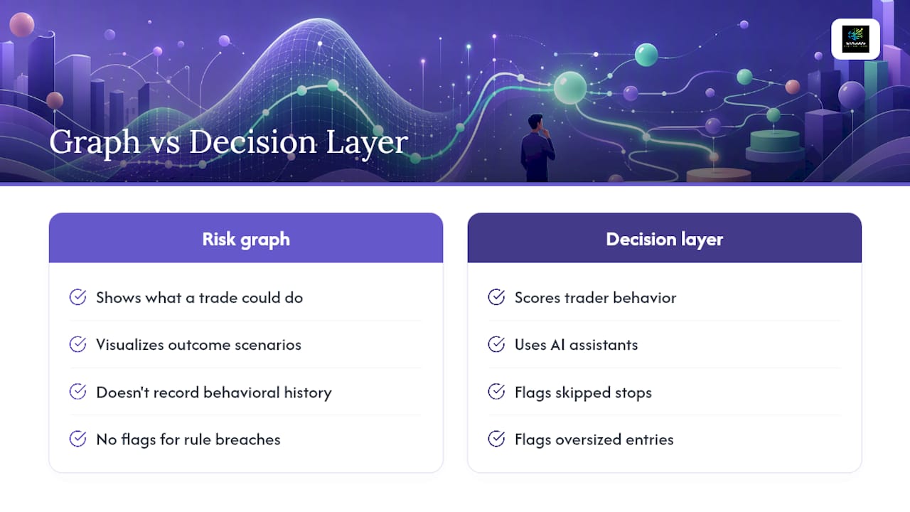
A risk graph tells you what a trade could do. It doesn't tell you whether you're the same trader who followed your rules on the last five setups. That's the gap some platforms aim to close using behavioral scoring and AI assistants to flag patterns like skipped stops or oversized entries before they repeat.
For a deeper look at how scoring works before you click a trade, our step-by-step scoring guide walks through the process, and the Knowledge Hub covers the behavioral concepts behind it in more depth.
Treat the Graph as a Gatekeeper, Not a Forecast
Too many traders read a risk graph like a prediction, then feel betrayed when the stock does something the curve didn't "promise." A risk graph is a boundary map. It tells you the worst case and the best case, nothing about which one is coming. The traders who last treat every graph as a pre-trade checkpoint. They ask the same measurable questions every time, sizing, stop, POP, IV scenario, correlation, before capital moves. Ad hoc judgment fails eventually. A repeatable checklist doesn't.
An Optional Layer for Traders Who Want More Consistency
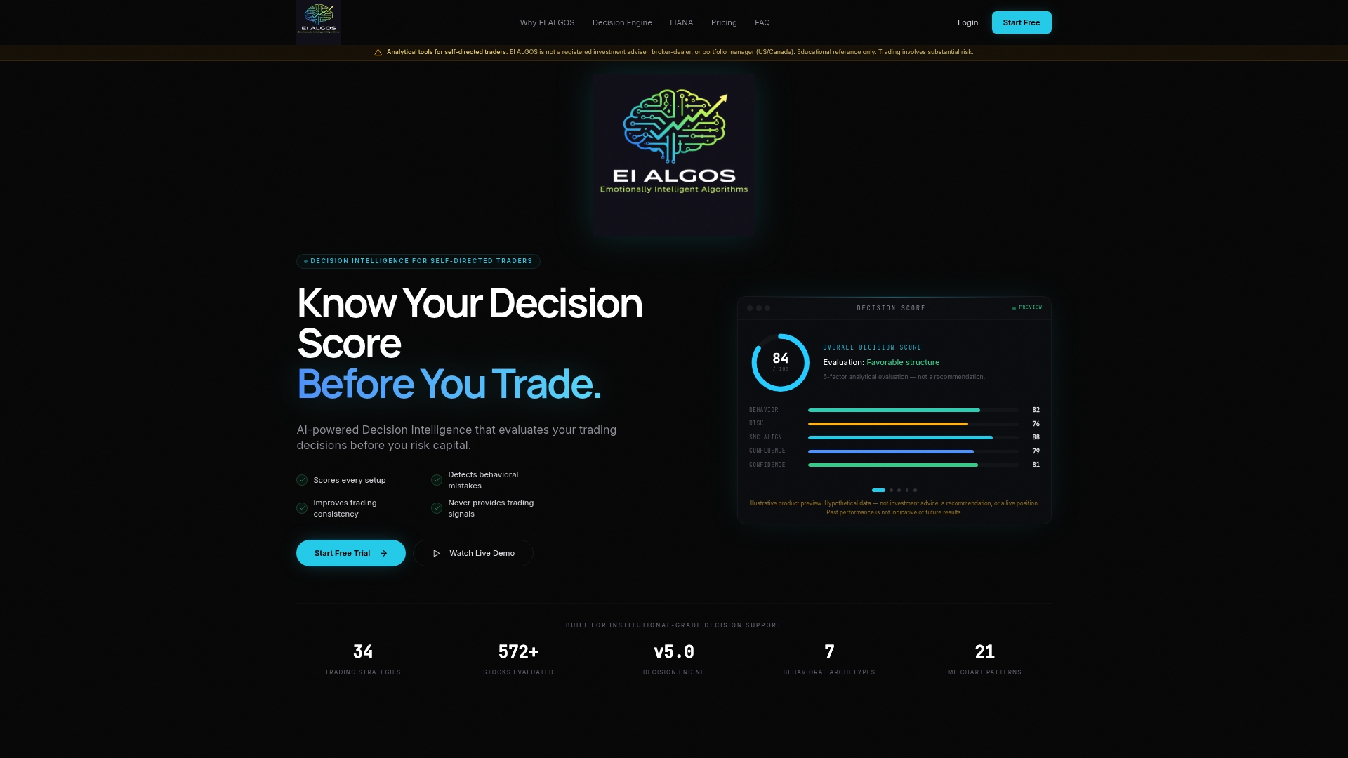
Reading the curve correctly solves half the problem. Sticking to what it tells you, trade after trade, solves the other half. Eialgos adds that second piece without replacing your modeling work. Its six-factor engine scores each setup on the behavioral and process factors a static graph can't see, while the LIANA assistant surfaces personalized feedback on patterns like premature exits or oversized entries.
Pair it with your existing checklist, position sizing rules, and volatility scenarios rather than swapping one for the other. If you're curious what your own setups reveal about your decision-making, the subscription page walks through current plans, and the platform overview explains how the scoring engine and LIANA work together on your next trade.
Sources
For the foundational definitions used throughout this piece, Britannica's options risk profile guide and Investopedia's risk graph explainer remain the clearest starting points. For scenario modeling and expected value, TradeAlgo's options profit calculator guide and Options Trigger's risk management framework go further into Greeks-based sizing. For applied workflows on the behavioral side, see our posts on risk management trading rules and calculating risk of ruin.
- Options Risk Profile | Defining Profit, Loss, & Breakeven Parameters | Britannica Money
- Risk Graph: What It is, How It Works, Examples | Investopedia
- Options Profit Calculator: How to Model Any Trade | TradeAlgo
- Options Trading Risk Management: Essential Framework for TradingView Traders